eleventy-plugin-images-responsiver
Global solution for responsive images in Eleventy, allowing authors to use Markdown syntax for image and yet get responsive images in generated HTML.
| « back to home | < back to step 3 |
Step 4: Images dimensions
Run it
In the folder of the tutorial step, run a clean install then build in developer mode:
npm ci
npm start
Sources are in src/ and build result is in dist/.
Check the result
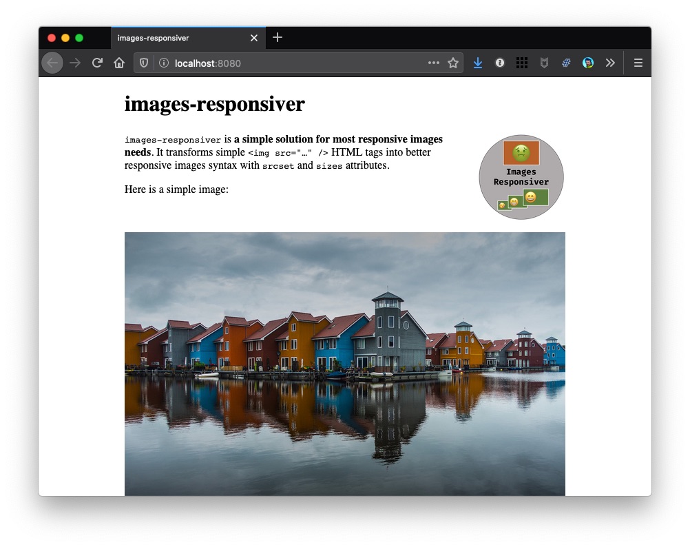
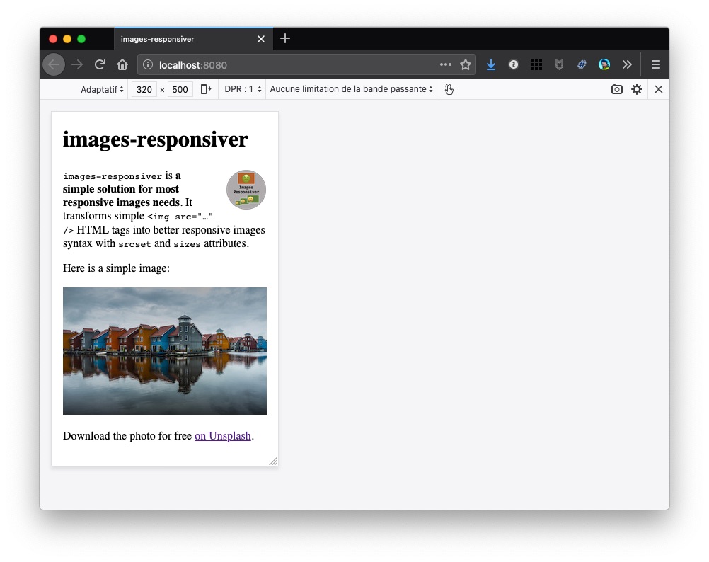
If you open http://localhost:8080/ in a browser, all images should be back, on all viewports! 🎉
Here is a screenshot on desktop:
And here on simulated mobile:
How does it work?
We wanted to tell the plugin about pristine images’ actual widths, so that transformed HTML wouldn’t include impossible widths.
Why invent a new parameter for the plugin? We already have the width attribute in HTML, so we used it, so that the plugin can read it.
To add the width attribute to HTML, we added it to our Markdown, thanks again to the Markdown-it Attributes plugin (remember the logo class on the logo image?).
For example, we replaced this:
{.logo}
With this:
{.logo}{width=400}
The plugin reads the image’s width from the attribute in HTML (from the HTML, really, not from the image file properties), and uses it as a maximum value for the list of resized images in HTML.
If it was supposed to add a (or multiple) larger width(s), it doesn’t, but it adds the pristine image’s width. For example, if the plugin was supposed to generate 5 values from 320 to 1280 pixels, it would have generated this list: [320, 560, 800, 1040, 1280]. But the pristine image for the logo is 400 pixels wide, so the plugin generates only this shorter list: [320, 400].
Note: If you fear forgetting to add a width attribute to some images, you can run the build in debug mode (learn more about debugging here), you’ll get warnings about missing width attributes. Instead of npm start, run DEBUG=images-responsiver:* npm start.
Note: Specifying both width and height attributes on images helps browsers prepare the required area in the page even if the image has not yet been downloaded. It enhances the page rendering performance, and reduces Cumulative Layout Shift, which is very good for the user experience.
Now… what?
Unfortunately, there is still an issue with this transformed HTML.
Reading the transformed HTML, you might have noticed that both images’ sizes attributes have the same value: sizes="100vw". This means the browser thinks both images are supposed to be rendered on the full width of the browser’s viewport.
It’s almost true for the big photo, at least on smallest viewports, but always really false for the logo, which is at most one fifth of the viewport.
It means the browser still downloads images much larger than necessary.
Note: That’s why the logo was visible on mobile in step 3, because the viewport was 320 pixels wide, like the only available image. So what looked right was in fact wrong… 😅
Let’s see how to fix this in step 5.