eleventy-plugin-images-responsiver
Global solution for responsive images in Eleventy, allowing authors to use Markdown syntax for image and yet get responsive images in generated HTML.
| « back to home | < back to step 2 |
Step 3: Resized images
Run it
In the folder of the tutorial step, run a clean install then build in developer mode:
npm ci
npm start
Sources are in src/ and build result is in dist/.
Check the result
If you open http://localhost:8080/ in a browser, images should be back. 🥳
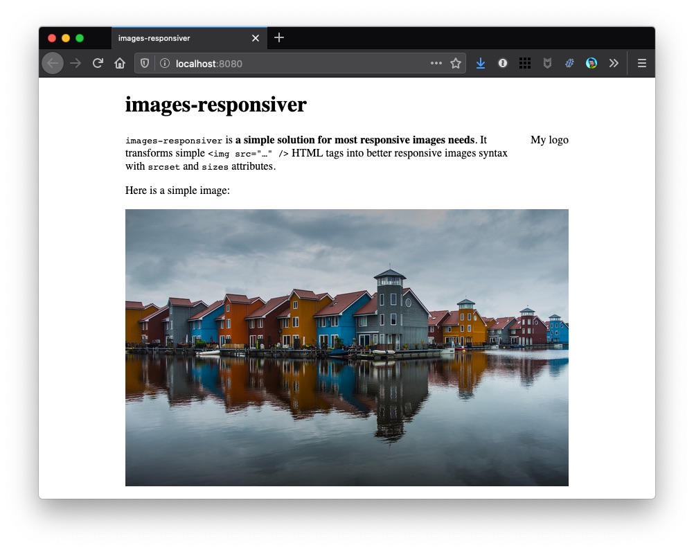
Here is a screenshot on desktop:
And here on simulated mobile:
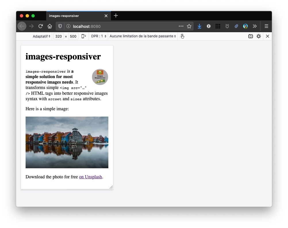
Oh… well, the photo is there in both screenshots, but the logo is there only on mobile… 🤔
How does it (partially) work?
We didn’t change anything in .eleventy.js.
We created the multiple resized images manually, so that they are available for the browser.
Unfortunately, the pristine (a.k.a. “untouched original”) logo image is only 400 pixels wide, so we couldn’t create images my-logo-560.png, my-logo-800.png, my-logo-1040.png and my-logo-1280.png the HTML is telling the browser about!
So while the my-logo-320.png version is enough for the mobile view, the desktop view tries to load a larger one (after all, our HTML tells him it is available) and fails.
Now… what?
So we have to find a way to tell the plugin the image’s width, so that it doesn’t add a larger one to the transformed HTML.
Let’s see how to do this in step 4.