eleventy-plugin-images-responsiver
Global solution for responsive images in Eleventy, allowing authors to use Markdown syntax for image and yet get responsive images in generated HTML.
| « back to home | < back to step 4 |
Step 5: Presets
Run it
In the folder of the tutorial step, run a clean install then build in developer mode:
npm ci
npm start
Sources are in src/ and build result is in dist/.
Check the result
If you open http://localhost:8080/ in a browser, all images are still there, and should weight much less! 💪
Nothing changed visualy.
How does it work?
To make sure the browser knows the width of the image to render, we have to use the sizes attribute on each image. We need different sizes attribute values for different image use cases.
But we don’t want to repeat them for each images, and we want to provide content authors (even if that’s us) with something as simple as possible so that they can focus on content.
Let’s define presets, and configuration options attached to them.
First, we define a default preset that will be used for all images:
const presets = {
	default: {
		sizes: '(max-width: 45em) 90vw, 40em',
	},
};
We set the default sizes attribute value, considering we will never have any image larger than the content (remember, 90 % of the viewport but never more than 40em).
(max-width: 45em) 90vw, 40em now overrides the plugin’s default value of 100vw.
We now need to add a specific overriding preset for the logo, which needs a different sizes value, because it takes only 20 % of the content area (20 % of 90vw = 18vw):
const presets = {
	default: {
		sizes: '(max-width: 45em) 90vw, 40em',
	},
	logo: {
		sizes: '(max-width: 45em) 18vw, 8em',
	},
};
We then use these presets as options for the plugin:
eleventyConfig.addPlugin(imagesResponsiver, presets);
We also need a way for content authors to specify what preset an image should use, if the default one is not enough. We will use a data-responsiver data attribute, with the name of the preset as the value.
Once again, the Markdown-it Attributes plugin helps us. We can change the Markdown for the logo from:
{.logo}{width=400}{height=400}
To:
{.logo}{width=400}{height=400}{data-responsiver=logo}
This syntax is becoming really verbose 😱, but don’t abandon now, it’s really worth it, and we’ll see a little later how to make it easier for the content authors!
Check the result of the transformation to see how the images now have different sizes attribute values:
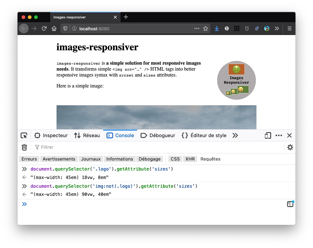
You can also check the HTML:
Note: Each image can use multiple presets in the data-responsiver attribute, each value separated by a space (like classes). Attributes from each preset surcharges the previous one(s), in the order they’re declared.
Now… what?
Let’s see how we can improve daily work of content authors in step 6.