eleventy-plugin-images-responsiver
Global solution for responsive images in Eleventy, allowing authors to use Markdown syntax for image and yet get responsive images in generated HTML.
| « back to home | < back to step 1 |
Step 2: Default behaviour with the plugin
Run it
In the folder of the tutorial step, run a clean install then build in developer mode:
npm ci
npm start
Sources are in src/ and build result is in dist/.
Check the result
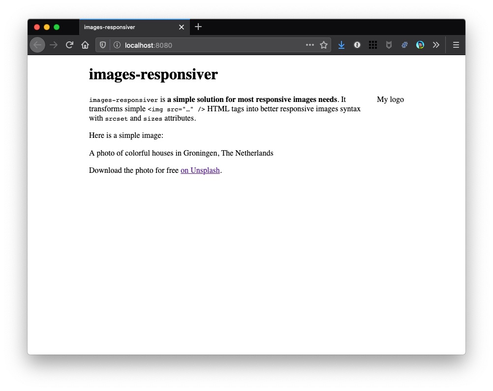
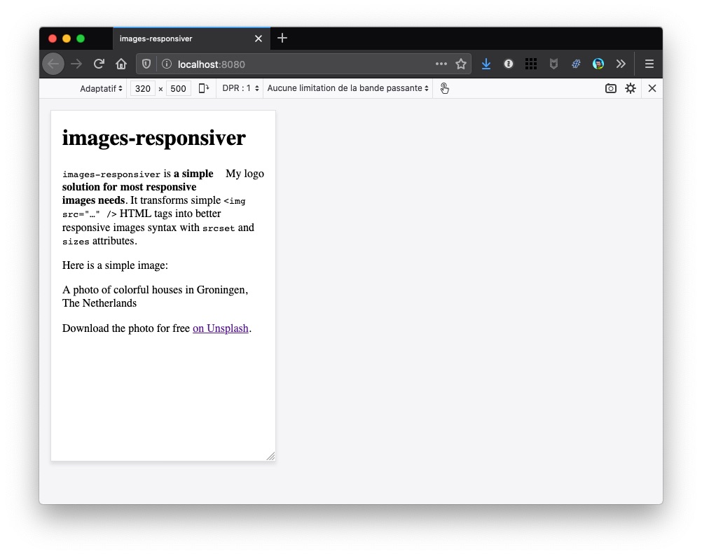
If you open http://localhost:8080/ in a browser, no image should be visible… 😅
Here is a screenshot on desktop:

And here on simulated mobile:

Fortunately, there are alt attributes! 💪
How does it work? (even if you might think it is not)
We installed the plugin:
npm install eleventy-plugin-images-responsiver --save-dev
And here’s what we added to .eleventy.js:
import imagesResponsiver from 'eleventy-plugin-images-responsiver';
eleventyConfig.addPlugin(imagesResponsiver);
This is the simplest way to add the plugin without any specific configuration.
Images are not visible because the transformed HTML (using default configuration) tells the browsers about images with names like colorful-netherlands-320.jpg, colorful-netherlands-560.jpg while we actualy only have one colorful-netherlands.jpg image file.
Now… what?
Let’s see how to provide these resized images to browsers in step 3.