eleventy-plugin-images-responsiver
Global solution for responsive images in Eleventy, allowing authors to use Markdown syntax for image and yet get responsive images in generated HTML.
| « back to home | < back to step 0 |
Step 1: Default behaviour without the plugin
Run it
In the folder of the tutorial step, run a clean install then build in developer mode:
npm ci
npm start
Sources are in src/ and build result is in dist/.
Check the result
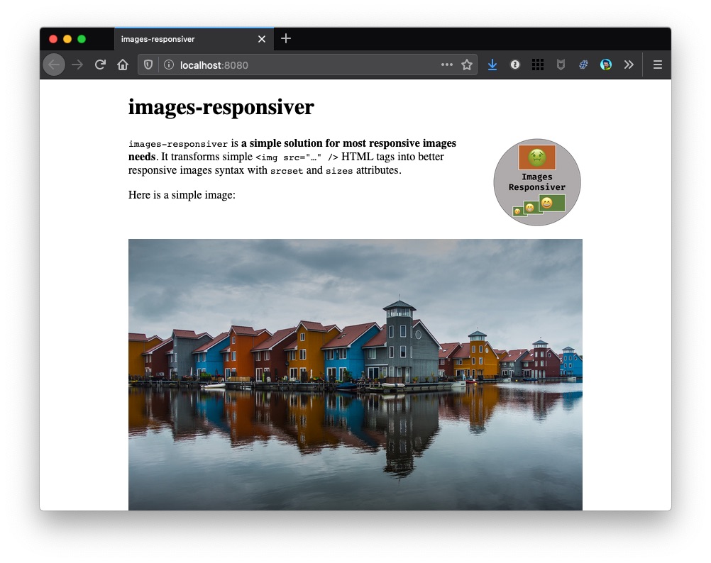
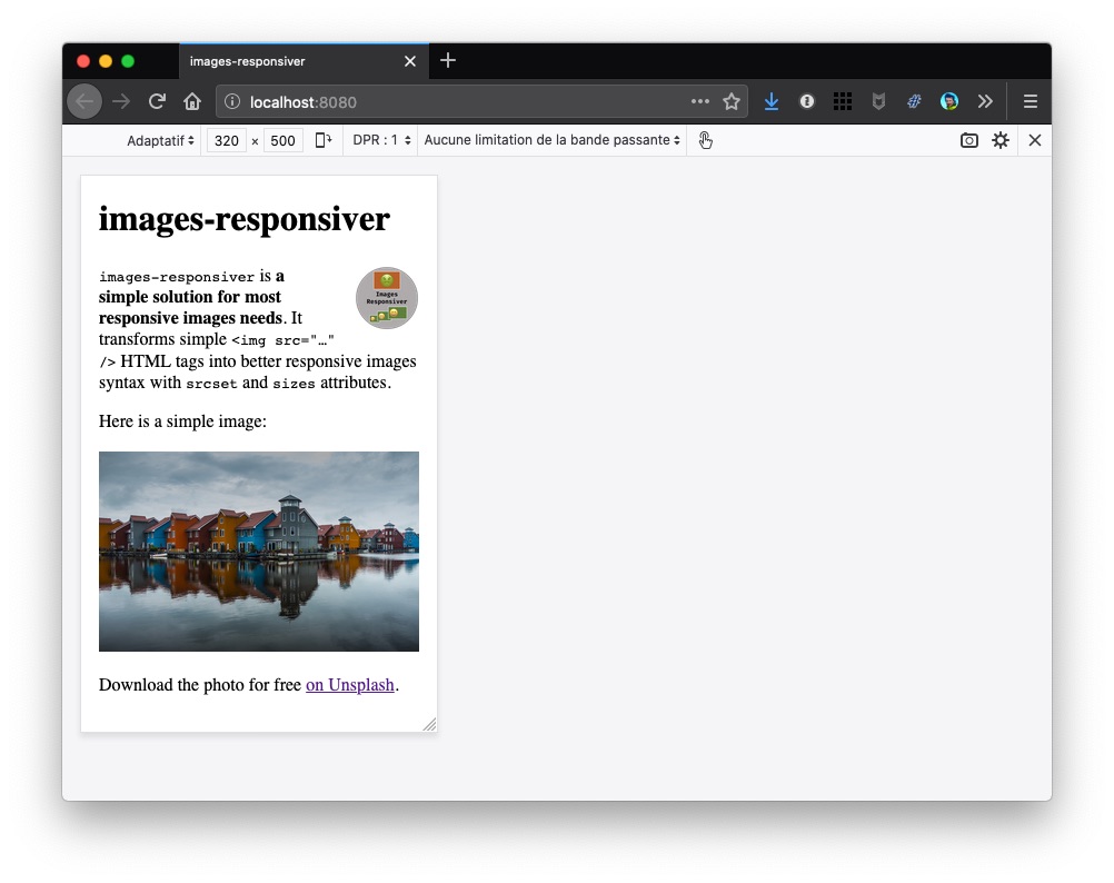
If you open http://localhost:8080/ in a browser, both images should be visible.
Here is a screenshot on desktop:
And here on simulated mobile:
We used this CSS file:
We want the content to take 90 % of the available space, but never more than 40em (better for readability of multi-lines texts), and the logo to use 20 % of this content width, floated on the right.
Note: We used the Markdown-it Attributes plugin to add a logo class to the logo image for styling (width, float on the right, etc.). This plugin allows adding attributes to elements using this syntax for example: {.logo}. This plugin will be even more useful later.
We can open this page in different browsers, on different devices, with different viewport widths and screen densities, the very same (potentially heavy) image files will be downloaded. Not cool for people on small devices with low resolution, and potentially bad connexions.
Now… what?
Let’s try to enhance it with the plugin in step 2.